Given the abundance of home design ideas out there, homeowners have a myriad of ways to beautify their home. However, there are certain decorating mistakes that even experienced designers can make. Here’s some advice on how you can avoid making these design blunders.
1. Using insufficient/wrong lighting
Even the most beautiful interior design plans can be thwarted by bad lighting. Avoid making your room look too cold or too claustrophobic by utilizing lighting options at that are better suited for your ceiling height. (a chandelier, floor lamp, desktop lamp, etc.). For example, low-hanging lights like chandeliers are great if you have a high ceiling, but if you have a low ceiling, large chandeliers will only make your ceiling look even shorter.

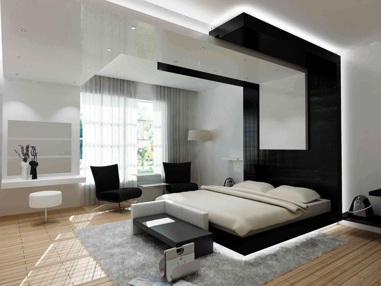
The hidden lighting extending from the bed edges to the ceiling add a degree of sophistication to the room.
2. Going crazy with throw pillows
They're affordable, easy to swap out, and a great way to transform the look of a room; however, it's easy to get carried away with them. Having too many throw pillows only makes your living space look cluttered. If throw pillows are deflated and flat, or more outdated than trendy, it's time to replace their covers or toss them entirely. For 2/3 seater sofas, a safe amount is 2 throw pillows, and for armchairs, it’s generally recommended to use only 1 throw pillow.
Avoid heavily patterned pillows if your sofa already has patterns on it to avoid a visual clash! It’s always good to have at least one pillow in a single, solid colour to keep your colour scheme grounded.

With just 2 throw pillows, there’s plenty of space on both sides of our 3-Seater STARK sofa for you and your loved ones!
3. Hanging on to pieces that no longer serve you
It can be hard to get rid of belongings that have sentimental value or that you shelled out big bucks for, even if they’ve outgrown their purpose. If you don’t, however, they’ll begin to overwhelm your home until it gets more cluttered than cosy. Be honest with yourself and sort out the pieces you can really use, and get rid of the rest.

Not using it anymore? Get rid of it!
4. Cramming many pieces of furniture against a wall
Pushing every piece of furniture flush up against a wall can create an awkward, empty space in the middle of the room, exuding a formal and unwelcoming vibe. Utilize the space available and warm up the room’s vibe by placing some pieces in “open” positions. No one will mind seeing the back of your sofa – certainly not with a Scanteak piece!

Who says that a shelf or sofa has to be placed against a wall to look good?
5. Designing without a plan
With how easy it is to purchase furniture online nowadays, it’s not uncommon for us to snag a piece that we fall in love with at first sight – only to realize that it doesn’t go well with our home when it arrives.
Every space has its own distinct style and purpose, and it's important to figure out what that is before you begin to decorate. Even eclectic-style rooms have a cohesive design theme that holds them together.
You don't need to know exactly where each piece of decor will go, but you should have a general idea of what you want.

Making a list not only helps you to organize your thoughts, it can benefit your wallet by allowing you to compare the best deals available!


